The Secret To Choosing Paint Colors That Make Rooms Feel Larger
Hey there! Ever stood in a room in your house and thought, “I swear these walls are inching closer every day”? We feel you. It’s a common Bay Area woe, especially in some of the older, charming homes we work on in Walnut Creek and Oakland. The good news? You don’t need to knock down walls to steal back some square footage. Often, the most powerful tool for a spatial illusion is already in your hand: a paint can.
We’re EA Home Builders, and as a general contractor specializing in everything from whole house remodeling to custom remodels in Contra Costa County, we’ve seen firsthand how the right color can completely transform a space. It’s one of the simplest, most cost-effective tricks in our book. So, let’s pull back the curtain and talk about how to choose paint colors that push those walls out and make your rooms feel wonderfully, blessedly larger.
The Magic of Light: Why Lighter Reigns Supreme
Let’s start with the most basic principle. Lighter paint colors make a room feel larger. It’s not just an old wives’ tale; it’s simple physics. Light colors are reflective. They bounce natural and artificial light around the room, making the space feel airy and open. Dark colors, on the other hand, absorb light, making walls feel like they’re closing in.
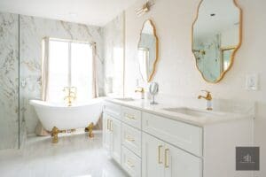
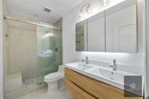
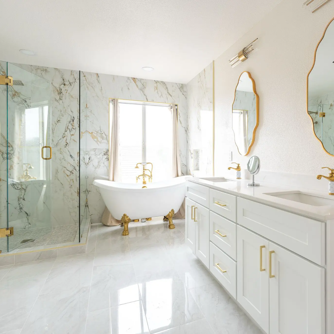
Think of it this way: a bright white ceiling feels sky-high, while a dark, moody one can feel like a low-hanging storm cloud. We apply this logic all the time in our projects, especially during a bathroom remodeling or kitchen remodeling job where space is often at a premium.
But wait, does this mean you’re sentenced to a life of sterile, hospital white? Absolutely not. The world of light colors is vast and full of personality.
Here’s a pro tip from our expert home improvement team:
- Off-Whites & Creams: Warmer and cozier than pure white, perfect for north-facing rooms.
- Very Pale Grays: A modern, sophisticated alternative that still feels open.
- Pastels & Tones: Soft blues, greens, and lavenders can add a hint of color without sacrificing the feeling of space.
The goal is to create a seamless, expansive visual field. When the walls and ceiling are similar light tones, the eye travels smoothly across the room without hard stops, making the entire area feel more unified and, you guessed it, bigger.
The Monochromatic Magic Trick: One Color To Rule Them All
Alright, so we’ve convinced you to go light. But what about an accent wall? IMO, in a small room, a bold accent wall can be your worst enemy. It literally stops the eye dead in its tracks, visually chopping the room in half and making it feel smaller.
Instead, we’re huge fans of a monochromatic color scheme. This means using different shades, tones, and tints of a single color throughout the space. It creates a ton of visual interest without any of the choppiness.
How we use this in our custom remodels:
- We might paint the walls a soft, pale gray.
- Use a slightly darker shade of the same gray for the trim to add subtle definition.
- Incorporate an even darker shade in the textiles, like a throw pillow or rug.
This layering effect adds depth and sophistication while maintaining that all-important feeling of continuity and flow. It’s a trick that works wonders in a long hallway or a snug living room. It’s one of the first things we discuss with clients planning a whole house remodeling project, as it helps create a cohesive feel from room to room.
Don’t Forget the Fifth Wall: Your Ceiling
We know, we know. The ceiling is easy to ignore. Most people just slap a standard white on it and call it a day. But if you really want to maximize the feeling of height, you need to think strategically about your fifth wall.
The classic advice is to paint the ceiling a bright white to “lift” it. This works great. But for an even more powerful effect, try painting the ceiling the same color as the walls, or just a half-shade lighter. This blurring of the lines between wall and ceiling makes the entire box of the room feel larger. It’s a bold move that pays off big time, especially in rooms with lower ceilings, a common feature we address in many basement remodel projects.
Sheen & Finish: The Unsung Hero of Spatial Perception
Okay, let’s get a little technical, but we promise to keep it painless. The sheen of your paint—that is, how shiny it is—plays a massive role in how light interacts with your walls.
Here’s a quick breakdown:
| Sheen Level | Best For | Why It Works for Small Spaces |
|---|---|---|
| Flat/Matte | Low-traffic areas like adult bedrooms, formal living rooms. | Non-reflective, perfect for hiding wall imperfections. Creates a smooth, uniform appearance. |
| Eggshell | Living rooms, dining rooms, hallways. | Has a soft, velvety luster with minimal shine. A great, durable all-rounder. |
| Satin | Kitchens, bathrooms, kids’ rooms, trim. | Has a soft, pearl-like glow. Easier to clean and reflects more light than eggshell. |
| Semi-Gloss | Trim, doors, cabinets, high-moisture areas. | Quite shiny and highly reflective. Bounces a ton of light around, making it great for trim to define space without color. |
| High-Gloss | Accent furniture, doors for a dramatic effect. | Extremely reflective, almost mirror-like. Use sparingly, as it can highlight imperfections. |
For making a room feel larger, we often lean towards satin or even semi-gloss for trim in a small space. That extra reflectivity acts like a tiny mirror, amplifying light. We always use a satin or semi-gloss in a bathroom renovation for this exact reason—it helps combat the cramped, damp feeling an older bathroom can have. Just FYI, the higher the sheen, the more it will show off any bumps or flaws in your drywall, so prep work is key!
Color Placement: A Little Strategy Goes a Long Way
Sometimes, the secret isn’t just the color itself, but where you put it. Think of paint as a tool to guide the eye and correct architectural quirks.
Ever wondered how to make a long, narrow room feel wider?
Paint the two shorter walls (the ones you see when you walk in) a slightly lighter color than the two longer walls. This visually brings the shorter walls forward, making the room feel more balanced.
What about a room with awkward angles or a low ceiling?
Painting all surfaces—walls, ceiling, trim—the same light color can help the awkwardness recede, making the room’s shape feel more intentional and spacious.
This kind of strategic thinking is what separates a simple paint job from a professional one. It’s the same detail-oriented approach we take with every project, whether it’s a luxury home renovation in Danville or a functional basement remodel contractor job nearby. We look at the entire space, not just the walls in isolation.
Your Paint Color Questions, Answered!
We hear a lot of the same great questions from homeowners. Let’s tackle a few of the big ones.
1. Can I ever use dark colors in a small room?
Sure, if you’re brave! But there’s a right way to do it. A very dark color can actually be dramatic and cozy in a room with great natural light, as it creates a sense of depth. The key is to ensure your trim is crisp white and your furnishings are light to provide contrast. We’d probably suggest trying it in a powder room or study first, not your main living area. It’s a high-risk, high-reward move.
2. What about white? Is it the best choice for every small room?
Not necessarily. White can feel cold and sterile if you choose the wrong one. The secret is in the undertone. A white with gray undertones can feel modern but chilly in a north-facing room, while a white with yellow or pink undertones will feel warmer. Always, and we mean always, test large swatches on your wall and observe them at different times of day before committing.
3. How much does professional painting cost, and is it worth it?
Ah, the eternal question of cost. The price for a professional paint job can vary wildly based on the size of your room, the prep work needed, and the quality of paint. But here’s the thing: a flawless, professional paint job is one of the highest-ROI improvements you can make. Pros know how to prep surfaces perfectly, cut in crisp lines, and apply paint evenly—all of which contribute to that spacious, high-end feel. A DIY job that’s full of drips and uneven lines can actually make a room feel cheaper and smaller. When you’re considering the overall cost of your home renovation, professional painting is a line item that pays for itself in the final result.
Ready to Transform Your Space?
Choosing the right paint color is a powerful first step, but it’s often just one piece of the home remodeling puzzle. Maybe you’ve realized that new paint will look fantastic, but what you really need is to reconfigure that cramped kitchen or finally finish that basement.
That’s where we come in. As a premier remodeling company right here in Contra Costa County, EA Home Builders lives for this stuff. We don’t just slap on a coat of paint; we help you envision the entire space. From a simple bathroom refresh to a massive home addition, we approach every project with an eye for how color, light, and layout work together to create a home that feels both beautiful and, yes, bigger.
So, if you’re in Walnut Creek, Danville, Oakland, or anywhere in the Bay Area and you’re tired of feeling like the walls are closing in, let’s talk. Don’t just search for the nearest “bathroom renovation contractor near me” and hope for the best. Find a partner who sees the whole picture. Check out our reviews, see the work for yourself, and then give us a call. Let’s make your home feel as spacious as you know it can be.