Here at EA Home Builders, we get it. Your bedroom should be your sanctuary, your escape from the chaos of the daily grind. It’s the place where you recharge, and frankly, where you probably spend a good chunk of your time scrolling on your phone before finally dozing off. So, why on earth would you settle for a color scheme that doesn’t actively promote peace and relaxation?
We’ve been the go-to home renovation contractor in Contra Costa County for years, and we’ve seen it all. From bold accent walls that looked better in the Pinterest pin to colors that felt more “institutional beige” than “cozy retreat.” We’ve learned that the right palette can make or break a space. So, let’s talk about transforming your bedroom into the calming haven you deserve.
Why Your Bedroom Color Matters More Than You Think
Ever walk into a room and immediately feel your shoulders drop and your breathing slow? Or, on the flip side, feel inexplicably agitated? A lot of that comes down to color. It’s not just mystical hocus-pocus; color psychology is a real thing that impacts our mood and nervous system.
When we tackle a whole house remodeling project, we always emphasize the bedroom’s unique role. It’s not the kitchen, where you might want energizing yellows, or a home gym where a pop of red can be motivating. Your bedroom has one primary job: to help you unwind and sleep. Choosing the right palette is the most cost-effective way to set that stage. IMO, it’s the first and most important decision you’ll make, even before you pick out that perfect new mattress.
The Golden Bay’s Go-To Calming Color Palettes
Alright, let’s get into the good stuff. These are the palettes we consistently see work wonders in bedrooms across the Bay Area, from Danville to Oakland. They’re timeless, they’re sophisticated, and they actually work.
The Serene Coastal Neutrals
This isn’t about that boring, flat beige from the 90s. We’re talking about a sophisticated mix of off-whites, gentle greys, and soft taupes that mimic our beautiful Northern California coastline on a misty morning.
- The Vibe: Clean, airy, and effortlessly elegant. It feels like a deep, calming breath.
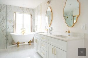
- Why It Works: These colors are non-stimulating. They reflect light beautifully, making even smaller rooms feel more spacious and open—a common goal in many of our bathroom remodeling projects as well.
- Our Go-To Shades:
- Whisper White: A white with a tiny hint of grey to keep it from feeling sterile.
- Misty Grey: A grey with clear blue or green undertones, not brown or purple.
- Sandy Taupe: A warm, earthy neutral that adds just enough depth without feeling heavy.
Think of this palette as the perfect foundation. It’s the little black dress of bedroom colors—always in style and always chic. It’s a favorite starting point for many of our custom remodels because it provides such a flexible backdrop for your artwork and textiles.
The Earthy, Organic Escape
If you want your bedroom to feel like a warm, grounding hug, this is your palette. Inspired by the rolling hills of Walnut Creek, this scheme leans into nature’s most soothing tones.
- The Vibe: Grounded, warm, and incredibly comforting. It’s a sanctuary that feels connected to the earth.
- Why It Works: Greens, in particular, are known to reduce stress and are easy on the eyes. Paired with warm, earthy tones, it creates a cocoon-like effect that’s perfect for shutting out the world.
- Our Go-To Shades:
- Sage Green: The undisputed champion of calming colors. It’s soft, healing, and universally flattering.
- Terra Cotta: A muted, softened clay color that adds warmth without the intensity of a true red.
- Oatmeal: A warmer, creamier alternative to white that just feels cozy.
We recently used a stunning sage green in a master suite home addition in Walnut Creek, and the homeowners swear they’re sleeping better. Coincidence? Maybe. But we like to think the palette had a little something to do with it.
The Soft & Dreamy Blues
You can’t talk about calming colors without giving a nod to blue. But we’re not talking about a bold, primary blue. We’re talking about the soft, hazy blues of the sky right before sunset.
- The Vibe: Tranquil, quiet, and deeply peaceful. It’s like a lullaby for your walls.
- Why It Works: Blue is scientifically proven to lower heart rate and blood pressure. It’s inherently linked to feelings of serenity and vastness.
- Our Go-To Shades:
- Hazy Skies: A blue with a significant amount of grey mixed in, making it feel soft and dreamy.
- Dusty Cornflower: A blue with a touch of violet for a subtly luxurious feel.
- Sea Glass: A blue-green that reminds you of, well, sea glass. It’s refreshing and calm.
This palette is a classic for a reason. It’s a safe bet if you’re nervous about color but want to move beyond plain white.
A Quick Guide to Choosing Your Shade
To make your life easier, we’ve put together this handy table. It breaks down the palettes, their best uses, and what they pair well with.
| Palette | Best For Rooms That… | Pro-Tip & Pairings | Mood Created |
|---|---|---|---|
| Serene Coastal Neutrals | Get lots of natural light or feel a bit small. | Pair with textured linens (linen, wool) and dark wood accents to avoid a “cold” feel. | Airy, Clean, Expansive |
| Earthy, Organic Escape | Feel a bit cold or lack coziness. North-facing rooms love this. | Bold this: Add natural elements like a jute rug, a live edge wood nightstand, and plenty of plants. | Grounded, Warm, Cocooning |
| Soft & Dreamy Blues | Are used by people who have trouble “switching off” their brain at night. | Layer in shades of cream and off-white to keep it soft, avoiding stark contrasts. | Peaceful, Serene, Restful |
Let’s Get Real: Application & Pro Tips
Choosing the color is only half the battle. How you apply it is what separates an amateur job from a professional expert home improvement.
Sample, Sample, Sample. (Did We Mention Sample?)
We cannot stress this enough. Paint looks dramatically different on a swatch, on your wall, in morning light, and in evening light. Buy sample pots and paint a large section (like 3×3 feet) on a few different walls. Live with it for a couple of days. You’ll thank us later. This is a non-negotiable step, whether you’re doing it yourself or working with a remodeling company like ours.
Think Beyond the Four Walls
The most dynamic bedrooms use color in more ways than one.
- Accent Wall: A classic move. Paint the wall behind your bed in your chosen accent color and keep the others a lighter, neutral shade.
- Ceiling Drama: Don’t ignore the fifth wall! Painting your ceiling a soft version of your wall color can make the room feel more intimate and cozy.
- Trim & Doors: For a super modern, streamlined look, paint the trim and doors the same color as the walls. It’s a subtle trick that makes a huge impact.
How Does This Fit With the Rest of Your Home?
This is a big one. When we’re planning a whole house remodeling project, we always consider the flow from room to room. Your calming blue bedroom might feel jarring if it’s right next to a vibrant, social hub like your kitchen remodeling space. Think about the sightlines from your hallway. The goal is a harmonious flow, not a series of disconnected color explosions.
Answering Your Top Bedroom Color Questions
We hear these all the time from clients, so let’s clear them up.
1. Will a dark color make my small bedroom feel even smaller?
This is the biggest myth in paint! While light colors do reflect light and can feel more airy, a dark, rich color on the walls can actually make the boundaries of the room seem to recede, creating a cozy, cocoon-like effect. The key is to embrace it fully—consider painting the trim and ceiling the same color to avoid chopping up the space. It’s a bold move, but it can be absolutely stunning.
2. My room doesn’t get much natural light. What colors should I avoid?
Steer clear of colors with strong grey or cool undertones, as they can feel a bit chilly and gloomy in a low-light room. Instead, lean into the warm, earthy palette we mentioned. Shades like creamy off-whites, soft taupes, and muted terracottas will add warmth and make the space feel inviting, even on the cloudiest Bay Area day.
3. How do I know if a color has warm or cool undertones?
This is the trickiest part of picking paint! FYI, the easiest way is to hold your swatch up against a pure white piece of paper. Does the color look like it has a hint of yellow, red, or pink? It’s warm. Does it look like it has a hint of blue, green, or purple? It’s cool. This is where those sample pots become your best friend.
Bringing Your Vision to Life (Without the Headache)
Look, we know that a home remodeling project, even just painting a room, can feel daunting. You’re busy. The last thing you want to do is spend your weekend meticulously taping trim and cleaning brushes. And that’s where a team like ours comes in.
As your local general contractor right here in Contra Costa County, EA Home Builders handles the details. We’re not just a basement remodel contractor or a bathroom renovation contractor; we’re your partners in creating a home you love, one room at a time. From helping you finalize the perfect shade to moving and protecting your furniture, we make the process seamless. Don’t just take our word for it; check out our reviews to see what your nearest neighbors have to say about their experience.
Why wrestle with drop cloths and ladders when you can leave it to the pros? If you’re in Walnut Creek, Danville, Oakland, or anywhere in the Bay Area and you’re dreaming of a true bedroom retreat, give us a call. Let’s talk about your vision, the cost, and how we can make your calming bedroom a reality. After all, you’ve got more important things to do—like actually enjoying your new, peaceful sanctuary.